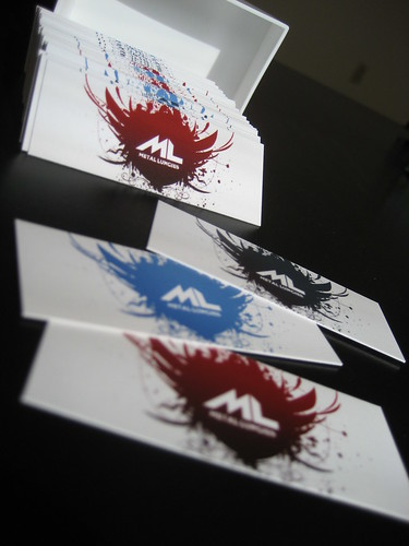
Metal Lungies Version 2.0.

IT’S FINALLY HERE.
Making ML a sleek custom setup is a dream I’ve had in my crazed mind for a minute as many of you in the ML inner circle know. Today it has finally become a reality. Boy, was it worth the wait, I still can’t believe this is ML. When HM and I started this little thing in HS, I couldn’t even fathom the idea we’d have an elite design rocking on the site. Hell, I didn’t believe anyone would even read it. Now we have interviews with
top artists, meeting all sorts of amazing industry folk.. and most importantly the most thoro/gully college aged (Buhizzle, you still count right?) writing team. This design is just the icing on the cake, ML is not playing internets. This is the start of something as Buffalo Sabres announcer Rick Jeannerette would say “Good.. Scary Good”.
Two huge thanks have to go out to two fellas that made all of this happen. First, Niklas Rosen who believed in the site as soon as he saw it and gave ML one sexy “brand” identity, check the moo cards! Second (and equally important) GraphicDZNR aka Jesse Dodds blessed ML with a design that without doubt is in the top echelon of music blogs. The dude simply doesn’t know how to say “No”, there wasn’t a feature or design element he wasn’t able to tackle. If there is a rockstar in web stuff it’s this guy. Using either of these guys for your projects you will come out with a winning result. I know this sounds like a cheap/cheesy promo plug, but this is the truth (I’m willing to testify in court!). Don’t think our relationship with these fly design dudes is done, ML will continue to collaborate with both of them in the future many times over, you better believe it.
Now here is a brief technical overview of the Bells & Whistles ML is sporting:
*Check the easels on the right side of the header, click on each one to change the background to one of your choosing (I’m rocking the wood one right now).
*Follow all the latest ML photos at MLickr (we so clever), the Metal Lungies Flickr feed.
*ML is formally stepping into all of this social internets business, we are represented on Last.fm, Twitter, and Facebook. Stalk the movement and meet fellow readers by clicking the ribbons on the edge of the header.
*Gravatar comment global avatar system compatible, sign up now.
*The items in the sidebar are collapsible, just hover over them!
*Digg/Delicous/Reddit/etc buttons coming REAL soon.
*Downloads looking realll clean with yellow boxes like this:
Dummy Link
*ML is viewed BEST in Firefox or Safari.. use Internet Explorer at your own risk, Mama I’m Sorry!
If there are any bugs you experience or you have suggestions please let ML know!
L’Chaim! I wish for you a hundred years of success but it’s my our time.


Chuck said,
Wrote on August 8, 2008 @ 11:26 am
The new setup is beyond dope, I love the easel effect with the customizable colors… Congrats
WIL said,
Wrote on August 8, 2008 @ 12:35 pm
i’m likin this new look
cleeean.
AaronM said,
Wrote on August 8, 2008 @ 3:06 pm
C’mon homey we major!
Dj01 said,
Wrote on August 8, 2008 @ 9:07 pm
Thanks for the kind words guys!
smokeYYY said,
Wrote on August 9, 2008 @ 11:36 am
Hellafied dope.
Zilla Rocca said,
Wrote on August 11, 2008 @ 9:52 am
I’m LOVING the new logo, y’all.
If/when you press up tees, I’ll MOS DEF wear them on stage!
djeurok said,
Wrote on August 11, 2008 @ 4:05 pm
site looks fresh!
Patrick said,
Wrote on August 12, 2008 @ 9:08 am
“so dope boy fresh..”